Click on the boxes to watch the case studies.
Data Science in rescue for Health Care payments
“Insurance coverage” is a subliminal danger lurking ‘somewhere’. The collective ‘pain’ is borne by all of us- the result- ever increasing premium payment in real terms [even when more actors join in- the relative premium payment increases]. Eventually it pinches & hurts.
Like all services wouldn’t you opt for a better return with lesser payments? Yes, of course you and I would always cherish that! This is how?

- Rather than a treatment that works 80% of the time, or even 100% of the time for 80% of the patients, a treatment might be effective for a small group.
- Requires an investment in tools to manage the population AND the person
- Organizations must align to evolving measure sets – and systems must be dynamic and proactive vs. reactive
- Need to employ organizational strategies that harness the potential in predictive population and personal health tools – and drive alignment across benefit plans, programs and incentives
- Data Science tenders these innovative measures as antidotes:
- Genomics: Using genomic technologies allow data scientists to drastically increase the amount of genomic data collected on large study populations. The availability of EMR data to study whether treatments are effective and improved techniques for analyzing data – personalized medicine at lower costs should become a reality with a proper legal regulatory scheme that creates the right incentives.
- Body Sensors: It is a sensor as small as the size of a Band-Aid which can collect information about your heart rate or temperature and then transmit that data using a wireless signal to a smartphone or another device. It’s cheap compute power to store and process are creating a meeting of medical science and data science.
- Electronic Medical Record: In the Meaningful use, Providers/Doctors/Clinics are bound to use to transmit the data electronically. It’s help to transmit the data in a secure way and help us design a system where the consumer pays only for outcomes.
Data science will play a role in creating this new system by creating a better understanding of the relationship between treatments, outcomes, patients and costs.
Human Resource Analysis
Towards building up of individual salary function for employees
Human resource analysis advances into more mathematical
A special treatment aided by Ideal Analytics
Overview
Human resource development now has carved up its own study space in management. Every company has to deal HR functions more and more professionally and very methodically. In addition to the regular soft skills, the biggest brain-work is now going down not only to deal with the policies of evaluating employee performance and corresponding incentives and remunerations, but every HR executive has to measure every perk with respect to the performances.
This we all knew. The industry was trying to figure out a general function of individuals’ pay package and how they have behaved over the years to figure out a general and average trend of the company and that translated down the line in every department and work centre. Such an endeavour would help take crucial decisions about how would the future salary increment of existing employees might look like down some years so that a variable cost function comes to shore and long terms budgeting may be done correctly. Finance function therefore would look for this input from the HR department. The bottom line would therefore be redrawn over a decade to a longer term with some reasonable estimates.
The company that provided the data and wanted a solution:
A large IT development, sales and solution provider with a rather healthy workforce of more than 500 employees out of which most are hands-on engineers, had this problem of attrition in this highly competitive market and the rising expectation of the employees in terms of salary and positional growth. They wanted to take the bull by the horn. Solve the most critical problematic and wanted an analysis tool to go-about.
This is highly mathematical and yet the HR executives who come from a mixed background wanted to have a ready solution which they could use and reuse with every passing month’s data and with every bit of a change in the position of each employee- the task is humongous!
Why Ideal Analytics:
Among the competition Ideal Analytics bobbed up the choice-ladder to them because of the very fast ad-hoc capabilities and fast churning depictions of the comparisons of facts with respect to dimensions.
HR data does have many more number of dimensions than any other industry function. The number of facts is not too low either. Additionally interesting is the fact that the rate of development of the salary, position [that is band and rank] over the years does follow some kind of pattern that has been found characteristic of the particular employee, her present position and salary.
Specific & salient case points in this study:
Salary goes on increasing- based on many factors, mainly based on position, group, project, performance and some others. But it has also been found that an employee has some ups and downs and over a longer period that trend also takes a particular pattern.
Below is a chart of the salaries of employees only over four years and one can see that the trend is not monotonic but something needing in-depth investigation:
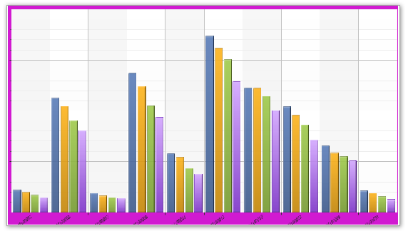
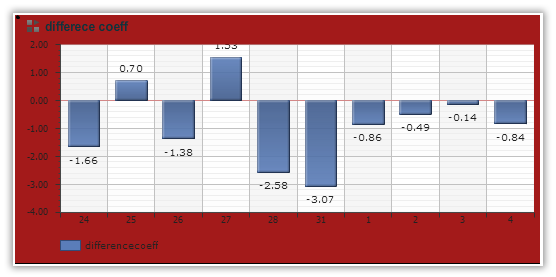
Now let us see how this trend is qualified by what we call the first differential rate of the salaries that is what is the difference of the salaries in one year per employee:
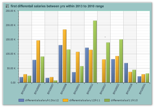
A simple pictorial depiction reveals that the differential of 2012 to 2011 was higher for some employee but for others it is the previous one. This one interests the analyst to delve deeper and find out the same picture with respect to their bands and ranks in performance.
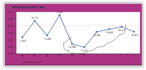
But a second differential of the salary figures between a difference of two years gives us a rather different picture.
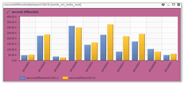
Placing these two figures we can easily make out that there is a behavior of salary which is not monotonically increasing but does really have a similar pattern with some nuances.
Mathematics creeps in:
With these two differentials an user can easily develop linear polynomial to build up the objective function of growth of salary and then she can figure out an aggregate depiction for a department or for functions within a company. [Let us not make our case study heavier with the mathematical treatment].
Qualify with other dimensions:
But to every point in that objective function if an analyst can qualify the value with respect to the present band and the transport facility provided by the company as a perquisite. It has already been a constant source of investigation that if the perquisite policy is in corroboration with the performance of the employees or their position. A tool like Ideal Analytics has really served them to single out every perquisite and measure it with the performance and/or retention in the company and/or position etc. This is what we saw in terms of transport mode:
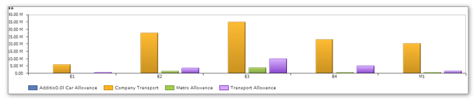
It is seen that the overindulgence of company transport is a matter of natural choice by the employees but the Metro is interestingly coming up as an alternate choice and that is regardless of employees in their bands. That even higher band employees might also choose the public transport.
Many more to fathom:
These are just a couple of examples and every day business analysts are looking for new ratios, new comparisons, new qualifiers and bringing up some wisdom that was not thought of earlier.
Ideal Analytics thus extends and expands the horizon of business acumen and business analysis. It helps even develop necessary mathematical functions and through depiction one finds out deeper need of new data capture and figure out new trends!
We are happy that we have developed the HR department into a Research, Development & Implementation hub for the company in their own function!
Share Value Case Study
Very fast realisation of the changes in share values and their current depiction
A business analysis tool provides better insight than usual manual analysis
Overview
If there is anything that nearly follows a random track then share value of a particular share or a group of shares is the right candidate. And still it is not fully. Share values move following some pattern that is very difficult to decipher, a random value generator is hardly any match to replicate the behaviour. Best of the mathematicians in the world have put up their sleeves and came out with many contributions and still could not hit the bull’s eye. Research is going on and will go on for a very long time to come. The behaviour of share values and thereafter their projection are so unusual that no two data sets with any dimensions or aspects or any combination really does justice.
Yet, it is essential to go ahead trying to do the impossible- to predict the next value or the value after some time. Mathematics deals with pre-defined formulae and finding out variances at every stage, but a pictorial depiction can trigger not only possibilities but also some new and individualized formulae to try with and find out the result. Many alternatives with many fast redesigned formulae throws many pictorial narration that can be placed side by side for visual comparison and further investigation. This speed of re-designing should emulate or pace up with the fast changing data in the transaction, keeping in mind that the pace of share value change is extremely fast and nearly impossible to present that pictorially. Technology have used even Artificial intelligence through neural networking to keep pace but where a human brain could not be challenged is that brainwave in a snap designing new formulae on-the-fly. Imagine the data behaviour at any point oozes out specific formulae instantaneously. It is a creative brainwork that mingles fast mathematical acumen based on the pictorial representation. Same data when seen through different chart patterns might trigger even further and deeper insights and excite the analyst to bring new formulae, new measures, new viewing patterns, new pivot points and new analysing logic.
In this article we would like to take you around a very simple and primary journey with a very small set of data. This is a data set for each day’s movement of share values reflected in every moment of change for one share. But the range of values we have chosen is quite substantial for a many number of days [although date wise] and thus aggregated on daily basis.
The Data:
Data belongs to a stock exchange in United States, so the value of the currency does have no meaningful value. We have used mostly ratios to rationalize the behaviour and the trends reflect the behaviours of the contemporary stock situation in the world. The weak economy is reflected in the reducing of volatility and yet depleting price of shares along with depleting volumes being traded. We have found even long lull in volatility or relative stability of most active shares for weeks at a stretch. Thus a conscious analyst can infer about general economic scenario from share value movements.
Shares have typically four values: Open value, Close value, Daily high value, Daily low value. To this there is another macro value – the volume of share in trade on one single day. The values of shares are calculated and enlisted every passing second or minute. For a very active share [volatile or not] the share value is touched or changed very frequently because the share players are quite huge in number. There are many formulae to compute the volatility of any share value.
We have chosen our formulae by looking at the volume of shares traded and their price. To do that we found the best ratio to be the difference of the closing value from the opening value [or the net change of value on that day] rationalised by the difference of daily high and daily low! In ideal condition this value should not be more than one as the numerator is a subset of the denominator. But what would the result be if there is an aggregation? This is the extra advantage in pictorial depiction. We have found that pictorial depiction helps trigger mathematical creativity.
The positive value greater than 1 needed investigation; this could be due to some outlier value in the dataset or some data that is captured that was not ratified. The unscrupulous data was subsequently found.
The ups and downs inspired us to figure out the volatility, in fact there could be three types. The first is the well known price volatility – which is essentially the above picture depicted with a different chart pattern – a line diagram.
Let us take cognizance of the marked area, this region will reveal interesting results with other pictures below.
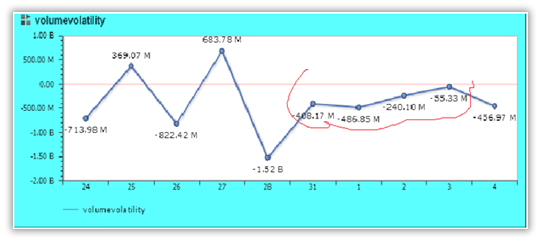
This is volume volatility that is how volume of sales that gets changed and a represent-able measure. We can very well see that the price volatility when and if qualified by volume volatility actually raises more investigative curiosity because some phenomenon needs external business acumen and logic to explain. Superimposing one picture over the other does not fit point by point or one does not cover the other fully. Thus the need of further and deeper investigation is warranted.
We add however the weekly volatility of a particular share:
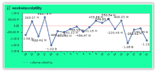
This one shows that for about two weeks the share price was stable in pieces week-wise, but the first week and the last week showed a much more volatility. However the last week’s volatility had a decelerating rate in price and tapered down to negative values. The entire effective life-cycle for this bout is thus charted and the share evidently could not hold a higher value and is practically less prudent to hold on to. Those who made some money within the intermediate time frame could really be termed lucky because the average of the share did not go much into the positive range. These shares are not very trustworthy for mutual fund players because of too much of speculation and the tenure in the positive range is small. The final phase could also be attributed to the general weakening down of the overall global economy and especially that felt in the share market.
We found a mountain of information and more of wisdom out of this molehill of a dataset. Pictorial depiction has given us wisdom out of visual presentation than pre-defined mathematical formulae would have given us. We needed an ad-hoc and fast-flexible analysis for this kind of analyses. Ideal Analytics has really made its mark to befit the special requirement!
Retail Sales Management
Retail sales management of retailers for variegated products
A case study of how smart analytic tools can acquire focussed wisdom & pin-point alert areas for down-the-line decision making
Overview
Retailing management is now the principal business channel for multi-product companies that would like to spread over in the shortest time span. Beyond the days of one-time indifferent market studies conducted by third party consultants, the contemporary trend is to use own product range in either test markets or with test price range and realize the market response and then decide on step-wise price fixing through differential skimming of the market. In this backdrop the most important focus area had become the general strategy of discount and discount policies as tactic for different dimensions like product, province, age group and of course retailers.
Discounts vary, and the variation and their viability capture markets or lose it. In a highly competitive market few products do sell in their MRP. The wholesalers get a commission, pass over a portion of that to the retailers who in turn keep something for their operating revenue and pass it on to the customers. Customers are basically lured by the discounts they get. The most important individual consumer behaviour now is the discount hunting by conscious end-buyers. Discount-race is not straight but very complex and most importantly most ad-hoc which even may vary not only demographically but also from shop to shop within the same retailer even.
This feature calls for a very smart, fast analytical tool that can bring out ad-hoc results on changing and changed values of facts and dimensions, almost emulating a what-if analysis scenario. Thus dealing with mammoth data should not in any way hinder or inhibit any analyst from using complex, multi-alternative generating analyses which she can super-impose and compare, ratify with other sets and brew data of one dataset with yardsticks from some other datasets of external applications.
The data in the case study:
The data belongs to a very big ticket multi-product company producing products for retail companies in big to small retail joints. The company reaches out to the end customer through very known big ticket retailers who are wholesalers and retailers together. The retail chain management has given rise to this phenomenon of big ticket companies who operate with the producers as wholesalers on the buying side and operates as individual retailers on the sale side with end customers. The inventory for usually conceived reasons should be very high, but that is a matter of passé. The present trend is to have Just-in-time inventories through ABC analysis and other methods and manage the front-line aided by a very efficient and slim back-end. Products should not rot and should not cost inventory space and inventory time in the warehouse. This definitely requires a very meticulous and atomic level surveillance and covering management. It requires very smart analysis tool – a tool that can be held and operated from any hand held platform, [preferably on the cloud], that can be implemented in any browser, without minimal baggage of data storing and data management headache. An analyst should play around with data as and when they come and change and from wherever and whenever they arrive and get resided. An analyst should be able to individualize mammoth data with other mammoth data sets in less than minutes or seconds. This is why this data set is used which is tens of millions of rows and yet churns out depiction in seconds.
MRP price or list price, with actual price and discounts on individual product level scale and rolled up to types or products, on shop level, on retailer level, on provincial level and on other dimensions are captured. The discounts are then vetted against these dimensions – here is a glimpse of that kind of data set.
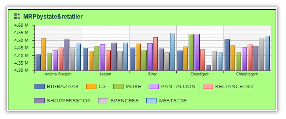
This one shows the MRP [total] of products that are sold through retailers in various states. We can see that the same retailer does have different aggregate discounts in different states. We can filter out the low discounting stores like Shopperstop in Chattisgarh vis-à-vis the same retailer Assam or in other states.
The following figure shows which types of items need to be discounted heavily to attract customers.
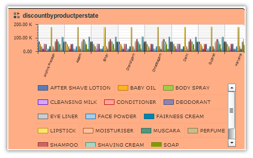
Obviously throughout India baby oil and cleansing milk can only be sold with high discounts, lipsticks need discounts but very soap and body spray are not given much discounts. May be the brand and fad value has worked its worth.
In the depiction below we single out the deep pocket retailers who can afford high discounts:
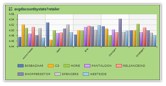
Obviously Big bazaar waylays Pantaloon in the discount race, MORE is a strong contender and Westside lies rather on the conservative side.
This is the most important depiction for decision making. Discounts by product category shows the products that need to go through a thorough price re-orientation.
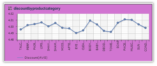
Product types that are highly discounted may now need to have a different price range to skim the market deeper. Those which sell with less discount may vie for another quarter or so with same price or even can attract more price if the volume of sales by product category are found to be big.
Inferences:
We see the pictures to figure out where we need to focus. We re-orient our tests and investigation to delve deeper into insights, we drill down to individual levels down the dimensions and we roll up to find how the aggregates behave. These faster calculations should not put more skill pressure on the analyst but should actually develop the business acumen. This is how technology becomes a supporting tool, a co-guide and not a asking master of business analysis.
Sales Process Management
Sales Process Management & How BI imparts wisdom through the right analytic tool
Overview

Sales is a methodical process. From the point of campaign to lead generation, lead follow up to lead engagement, from negotiations to closing of a sale – all are sequential process which with proper filtering and managing gives the final prize of a sale. The treatment of the winning track and that of the loosing track, gives the analyst better perspective and more focussed attention in later campaigns.
A LEAD is the first element that changes its state through various operations and then culminates to a SALE. Leads that are successful stay with the company as customers who are followed later for further campaigns. The “lost” leads need to go through an alternate process wherefrom some gains may come through.
The company in the Case study:
This is world’s leading Sales process management company that deals with partners who run specified campaigns and captures the successful sales from those campaigns through the partners who actually sell them.
This company has a very well defined process of Sale and measuring every step in that process through well defined metrics. The company after a long drawn meticulous perusal honed on to Ideal Analytics as the product of their choice. Their analysts used the tool for every step in analysis.
Experience of Ideal Analytics:
Ideal Analytics studied their entire process in detail and sifted through the huge data and brought out interesting inferences that were not being fathomed by the analysts.
Some examples:
Successful Leads in terms of numbers & in terms of amount of Sale with respect to regions, countries, counties in conjunction with stratifications in terms of even partners, time period, product/campaigns could be measured and visualized.
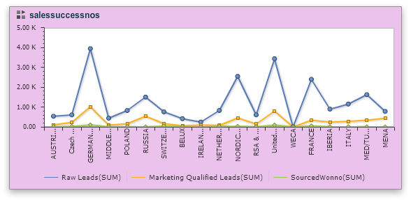
Additionally the rate of winning/losing leads, co-efficient of losses with respect to the investment, again classified in terms of territory and time-period could be figured out and visualized.
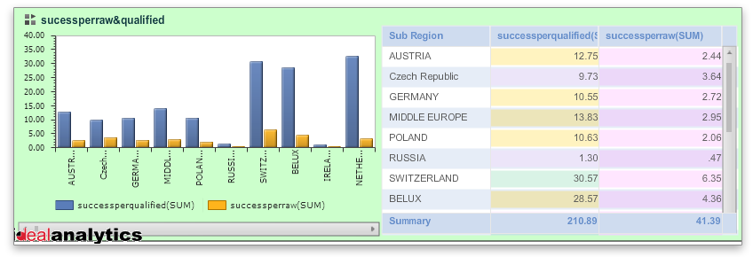
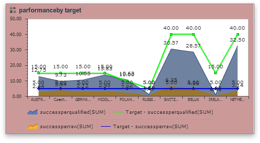
The results were rather interesting. It was found that the region which returned the most successful leads [ success in terms of completion of sales] actually were lagging when compared to the loss statistics of leads- this brought in light that the lead follow up management could have been bettered. Other factors too were brought to light. Regions or counties were classified in terms of amount of Sales that brought in bulk sales and high amounts. In fact the region that brought in more sales did not snatch the best of the laurels. This struck the inference that there are regions where small and medium takers are more and there are other regions or partners who have very high value customers- they may be less in number and therefore the aggregate amount may be lower but the unit value of sales is high in those areas. The aggregate consumer behaviour of a region, under a partner, for a service/product, could thus be classified in slabs and their performance measured against targets. The differential from target to actual results could then be measured in aggregate and also with respect to specified qualifiers or dimensions. The analysts did come to know the potential focus areas for follow up initiatives and design their forthcoming campaigns.
Sales of Services in Telecom Billing
Service Sales in Telecom billing sector Data Analysis tools shattered myths & set the perspective right
Overview
Telecom usage billing is a sale of service. Mobiles, Internet usage, broadband usage, along with various other communication services are billed to the customer depending on their usage. There are two broad-brush categories of billing – Pre-Paid & Post-Paid. Many types & categories of services are there within the two broad categories. Their usage is measured in seconds or pulses and customers pay based on that. Sales departments of various service providers invest in campaigns and advertisements and measure the sales they acquire from the customers. Meticulous accounting is the key to bill a customer and gain the confidence and loyalty of each customer.
The company in the Case study:
A giant service provider in telecom in India who has products in all possible wireless communication technology is the case we could reach out with the tool Ideal Analytics. Their business analysts analysed the data and them and our team in Ideal Analytics Solutions (P) Ltd, were really amazed to find knowledge snippets that not only shattered our commonly acquired mis-conceptions but did really find the quantitative differential values within the different ranges, dimensions and other measures.
Experience of Ideal Analytics:
Ideal Analytics provided the analysts the tool and the know-how to go-about with the tool. The analysts of the company had the privilege to run & familiarize with various case studies, examples and to-n-fro discussions. They embarked on their newly gain knowledge and within weeks they came out with startling inferences- the inferences that were not only mathematically interesting but business wise very revealing and path breaking.
What startled us:
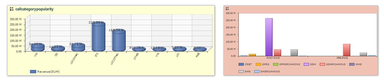
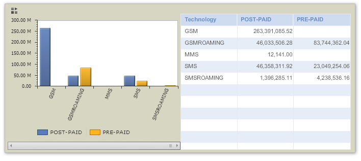
In this industry the overarching fact is the revenue earned. This single fact is qualified by many dimensions starting from Line-of-Business [Pre/Post paid], category of service, call-direction, even regions and many others. So the primary approach was to bring up a kind of comparison of the revenue earnings qualified through these dimensions.
Then we found out some general tests in terms of ratios and coefficients and did the next deep level of comparison.
We then classified the results with respect to derived measures and found the variations from generally held misconceptions.
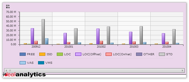
- We found that even today Post-paid connections are more popular and more revenue giving than the Pre-paid ones.
- We figured that only in case of GSM roaming the pre-paid ones triumph over the post-paid ones. This might tell us that people use Post-Paid connections for resident use and use a different pre-paid SIM when they are on the move, this way they keep a tab on their usage and cost. We have found that STD calls bring in more revenue than other types of calls.
- We found that the niche and hi-tech services are not that revenue earning compared to the traditional and simple calls.
- Our popular misconception was that the young subscribers actually are the most revenue givers- it is not, even fancy type services are far lower in the significance rank – at least for this company.
Through our tool we could compare between two facts i.e. measuring one fact when the other fact is reconfigured as a dimension. We found a complex curve that does not follow any regular polynomial expression. But we could easily extrapolate the last values in a small neighbourhood and can predict the next value [in that small neighbourhood]. This had been found to be more accurate than a statistically averaged out trend through normal correlation exercises. So, this kind of data depiction has provided more significant predictions, although in a proximate neighbourhood assuing no fast and drastic changes take place.
These are very important decision enabling points that actually changed the companies orientation in service and re-focussing much beyond the grapevine gossip that we most often confuse as market-intelligence. Empirical data and their flexible analysis has given more wisdom than hearsay in Sales of services in Telecom industry.
Education
Ideal-Analytics put to use at IIHMR, New Delhi
Ideal-Analytics is being used by IIHMR, New Delhi, to train their Healthcare Management students in Business Intelligence. Students are being taught what are the capabilities of an analytics tool and how such a tool can be put to use at hospitals.
Ideal-Analytics has made the licensed version of the application available to the students for use along with providing them adequate training to enable smooth usage of the tool.
The feedback that we have received from the first ever batch of students of IIHMR using Ideal-Analytics is very encouraging.
Mandeep says : “I was using SPSS software prior to Ideal-Analytics which involves lengthy procedure, coding, etc. for the simplest of analysis. With Ideal-Analytics I can reach from raw data to sharable analysis output in minutes”.
One of the Case Studies should be of specific interest to us. Chandravali Madan, who is working as an intern at Columbia Asia Hospital, New Delhi has used Ideal-Analytics to analyze the waiting times of various patients visiting the Radiology Lab before they were called for their respective checkups/tests.
Chandravali says : “I had only four hours to analyze the data available to me and prepare a presentation on the same.” Ideal-Analytics helped Chandravali to import the data (excel file) into the application which was available for analysis within minutes. She was also able to prepare interactive reports and presentations using the embed and template based reporting features of the application. “My Operations Manager was very impressed by the interactive output of the application and asked me to take him through the features of the application”, tells a visibly excited Chandravali.
The fact that Ideal-Analytics is a self-service, ad-hoc analysis tool coupled with the fact that we are offering it at up to 75% discount to educational institutes, makes it a better choice than any other open source analytics tool available in the market. Powerful analysis features can be accessed in a hassle-free manner.
Manufacturing Industry
POC for a large Multi-National Steel Manufacturing Organization in India. The organization has got numerous departments and there is an implementation of SAP throughout the organization. Each of these departments generates voluminous data, each and every day. For doing a trial, one particular department was identified.
Problem
The problem was associated with a simple report containing statements about pending payments along with some other details like, vendor code, material code, time pending, etc. They have developed an ABAP code to generate the report. But the sheer volume of the data was making it very slow, sometimes it took week-long to finish. There were lots of other problems due to which sometimes the report was not even getting generated at all. So they had to plan for it quite early, and in case the report is immediately required, they couldn’t provide it.
It was decided to restrict to 6 months of data for the pilot.
Solution
IdealAnalytics SAP integration team developed a quick SAP connector which would pull the raw transaction data from the R/3 database to IA. A derived column is created to store the pending days. A couple of derived columns have been created on the ‘Pending Days’ column to define some slabs like ‘Pending for less than a Week’, ‘Pending for less than a Month’, etc. Finally actual data loading is done. A report template is created which was very similar to the actual report they had used.
Result
The loading of data was completed in less than 30 minutes, which was more than 10 times faster than the ABAP query running time on the data. No. of records was 1,100,000.
Benefits
- The report could be run much faster.
- Data can be loaded incrementally in IA. So after the initial loading, with periodic incremental updates, the IA data will always be in Sync. And if the data is loaded, then looking at the report is matter of seconds. This increases the overall efficiency and reliability of the system, a lot.
- Due to loading of raw transactional data, customers could see a lot more and do much better analysis by themselves, rather than looking at the pre-configured reports, only.
Marketing Organisation
POC for a US-based organization specialized in providing their customers various types of mobile marketing platforms e.g., mobile websites, landing pages for mobile ads, SMS/QR coded landing pages, etc. We integrated with their databases to pull relevant data for one customer for analysis.
Problem
The problem was that the customers of the organization, wanted to look into the details of their visitors and wanted to analyze those data to get more visibility into it, e.g., kind of devices requests are coming, or the distribution of requests with different regions, etc.
Solution
Customer uses MSSQL server database, so the MSSQL connector was directly used, no customized connector needed to be developed for this. A simple query is written in the data-source to pull the required data from the database.
Result
The data is loaded successfully into IdealAnalytics and presented to the customers for self exploration and self analysis.
Benefits
The organization could share the results with their customers to showcase the performance of their application.
The organization could create live documents with relevant tables and charts and share these with their customers to showcase the performance of their application.
The organization also had an option to create different datasets for different customers and create users for the customers with permission on the corresponding datasets to do self analysis.
It was also very easy to identify the strengths and weakness of the app e.g., the analysis shows that hits from one particular location is much lower compared to others which means some action needs to be taken, etc.
Retail Industry
POC for a Singapore-based organization in the retail business of foods and beverages, spread over south-east Asia and China as well. We integrated directly with their databases to pull relevant data for analysis.
Problem
The organization was looking for a self-service analytics tool which will be used by their management members to explore the various aspects of the business, to enable them to take decisions.
Solution
Customer uses MSSQL server database, as the back-end database used by the foodmart application. A specialized join query was written to fetch raw transactional data distributed in several tables.
Result
The data is loaded successfully into IdealAnalytics and presented to the customers for self exploration and self analysis.
Benefits
After the initial loading of data, there was a provision of scheduled incremental loading so that the dataset will always be up-to-date.
Different view-groups were created, each with different sets of dashboards looking at different aspects e.g., customers, stores, products, etc.
Different drill downs were configured for different types of analysis e.g., a drill-down for Product goes like Family > Department > Category > Sub-Category > Brand, whereas another drill down for Customer goes like Gender > Country > State > City.
Travel & Living
POC for a global travel company managing corporate travel over the globe. We created a custom FTP connector to pull incremental data from an FTP server and pushed into IdealAnalytics for analysis.
Problem
The organization was looking for tool using which they will be able to analyze the different parameters contributing to their revenue. Not only that, they wanted to share the same tool with their clients as well who will be able to analyze their data only. And finally they wanted to take some report and send it to their customers regularly.
Solution
Customer used to drop incremental data in specified format (excel files) in an ftp server, the ftp connector of IdealAnalytics picked those files up, parsed and added to specific datasets.
Separate users were created and were provided access to different datasets.
Different report templates were created as per their requirements.
Result
The data was picked up successfully from the ftp server and were added successfully into corresponding dataset for self exploration and self analysis.
Benefits
- Customers didn’t have to load the incremental data manually
- Customers could share the application with their customers also, so that they can immediately get back if they observe any discrepancy in their data


